Mobile website builder
Make a website that looks right on every phone before anyone opens it on a laptop. Mobirise is a mobile-friendly website builder: every block adapts to small screens on its own, so there is no separate mobile version to build. Free for personal and commercial sites.







Updated October 2026 · by the Mobirise team
Mobirise at a glance
- What it is
- A website builder whose blocks are responsive, so one site works on phones, tablets and desktops without a separate mobile version.
- Free plan
- The desktop app is free, with the basic theme, 200+ blocks and unlimited sites. Online you get 3 sites on a free mobirisesite.com subdomain with HTTPS and 3 AI generations a month. Free sites carry Mobirise branding; personal and commercial use is allowed.
- Your own domain
- On Mobirise hosting it needs the BASE or GROW plan. On the free plan, publish from the desktop app to hosting you already have and use your domain there.
- Where it runs
- In any browser, including on a phone; as an Android app for Mobirise AI; and as a desktop app for Windows 7 or later, macOS 10.13 or later and Debian-based Linux that also runs without internet.
- Your files
- The desktop app saves the finished site as HTML, CSS and JavaScript on every plan. Exporting from the browser builder comes with BASE and GROW.
- Paid plans
- From $149 a year for all 220+ premium themes and extensions without branding; $199 or $249 a year adds online sites with your own domains and more AI generations.
- Not the best fit for
- A separate phone-only layout, native App Store apps, or importing a site built with another tool.
Network World reviewed it in 2015 as “a free, simple, drag and drop mobile responsive Web site builder”.
Which mobile website builder to choose
Almost every current builder makes sites that adapt to phones. The real differences are what you pay, who keeps the files and how much control you get over the phone layout.
- Free, with files you keep
- Mobirise: a free desktop app, HTML export, publishing to any hosting and 3 free online sites.
- Separate control of the phone layout
- Wix: a dedicated mobile editor for hiding or moving elements on phones only.
- Polished templates
- Squarespace, if a trial instead of a free plan suits you.
- An AI design to see before paying
- 8B AI: designing is free, publishing starts at $9 a month.
- Building the whole site in a phone app
- SimDif, whose iOS and Android apps match its desktop editor.
- A large online store
- Shopify or another dedicated commerce platform.
- A blog or content site
- WordPress.com.
- Control at every breakpoint
- Webflow, for designers who set the layout by hand.
- Low-cost hosting with an AI builder
- Hostinger, on a multi-year prepaid plan.
How Mobirise compares with other mobile website builders
A factual look at the builders people most often compare when they search for a mobile website builder, including the rows where others do better. Prices change several times a year, so check each provider before you decide.
| Mobirise | Wix | Squarespace | 8B AI | Hostinger | WordPress.com | Webflow | |
|---|---|---|---|---|---|---|---|
| Best for | Free sites you own: code export, an offline app, any hosting | Fine control over the phone layout | Polished templates | Seeing a finished AI design for free before paying to publish | Low-cost hosting with an AI builder | Blogs and content sites | Designers who want control at every breakpoint |
| Free plan you can publish on | Yes: 3 sites on a free mobirisesite.com subdomain, plus unlimited sites from the desktop app to your own hosting; both with Mobirise branding | Yes, on a Wix subdomain with Wix ads | No, a 14-day trial | No, designing is free; publishing starts with the Pro plan | No, a free trial without publishing | Yes, on a WordPress.com subdomain with ads | Yes, on a webflow.io address with a Webflow badge |
| Lowest paid plan with your own domain | BASE, $199 a year (about $16.60 a month) on Mobirise hosting; with your own hosting, free, or $149 a year (KIT) without branding | Light, $17 a month | Basic, $19 a month billed yearly, $25 monthly; many reviews still list the older $16 | Pro, $9 a month | Premium, $2.99 a month when prepaid for 48 months; renews at $10.99 | Personal, $4 a month | Basic site plan, $15 a month |
| Build a site with AI | Yes: four designs from a text prompt, sketch or screenshot; 3 generations a month free; refine by chat or by hand | Yes: a chat-based builder that creates an editable site, available on the free plan | Yes: Blueprint AI, a guided step-by-step setup | Yes: a full design from one sentence on the free plan; AI edits in chat on Pro | Yes: a site from a short description; publishing needs a paid plan | Yes: a preview with a limited number of free prompts; publishing needs a paid plan | Yes: a multi-page draft from a prompt, finished in the Designer |
| How the phone layout is made | Automatic, every block is responsive | A separate mobile editor for adjusting the phone view | Automatic, with mobile-specific adjustments | Automatic, the design is generated for each site | Automatic, plus mobile editing for adjustments | Depends on the theme | Manual breakpoints; desktop styles carry down |
| Native phone app for your site | Android app for AI generation, redesign and publishing; no iOS app | Yes, mainly for managing the site | Yes | No, edit in the phone browser | No, edit in the phone browser | Yes, for posts and pages | No |
| Export the site as code | Yes, HTML, CSS and JavaScript: free in the desktop app, on BASE and GROW in the browser | No | No, content export only | Yes, full HTML export on Pro | No | Content export (XML), not a static site | Yes, on paid workspace plans |
| Desktop app that works offline | Yes, for Windows, Mac and Linux | No desktop app | No desktop app | No desktop app | No desktop app | No desktop app | No desktop app |
| Publish to your own hosting | Yes, on every plan: FTP upload, GitHub Pages or a local folder | No | No | Yes, by exporting the HTML on Pro | Hostinger hosting only | No, sites stay on WordPress.com | Only by exporting the code |
Checked in October 2026 on each service's public plan pages and help documentation. Prices are in US dollars with yearly billing, taken from each provider's own pricing page on 13 October 2026; older reviews may quote earlier, lower prices, and prices can differ by country or need a longer term. Plans and features change, so confirm the details on the provider's own site before you decide.
Mobirise free and paid plans
The builder is free to download and use. Paid plans are billed yearly and unlock premium designs, online sites with custom domains and more AI; prices as listed on mobirise.com in October 2026.
Free
$0
- The desktop app with the basic theme and 200+ blocks
- Unlimited sites in the app, published to your own hosting
- 3 online sites
- A free mobirisesite.com subdomain with HTTPS
- 3 AI generations a month
- Mobirise branding on published sites
KIT
$149 a year
- All 220+ premium themes and extensions, Smart Cart and the chat button included
- Unlimited sites in the desktop app
- No Mobirise branding
BASE
$199 a year
- Everything in KIT
- 3 online sites with custom domains
- 100 AI generations a month and premium AI designs
- Site export from the browser builder
GROW
$249 a year
- Everything in BASE
- 10 online sites
- 1,000 AI generations a month
Publishing to your own hosting is unlimited on every plan. A first order comes with a 14-day money-back guarantee. See the Mobirise pricing page for the full list.
Who Mobirise suits, and who should look elsewhere
A good fit
- Small businesses and freelancers who want a free mobile-friendly site they control
- Anyone who wants to keep the files and choose their own hosting
- People who work offline or on a slow connection, using the desktop app
- Designers and agencies building straightforward client sites
Look elsewhere if
- You want a separate phone layout, hiding or moving elements on phones only; Mobirise adapts every block automatically, while Wix has a dedicated mobile editor
- You need an app for the App Store or Google Play rather than a website
- You run a large store with complex inventory and shipping rules; a dedicated commerce platform fits better
- You need your own domain at no cost on the builder's hosting; Mobirise's free plan uses a subdomain with a badge
- You expect AI-heavy work for free; the free plan includes 3 AI generations a month
- You want to edit an existing HTML site; Mobirise opens only its own projects
What a mobile-friendly site needs
Most visitors will meet your site on a phone first. These are the details that decide whether they stay, and Mobirise blocks take care of them by default.
Text you can read without zooming
Font sizes and line lengths change with the screen, so nobody has to pinch the page to read a paragraph.
Buttons made for thumbs
Calls, bookings and forms sit in tap targets large enough to hit on the first try, with room around them to avoid mistaps.
A menu that folds away
On narrow screens the navigation collapses behind one button and opens over the page when someone needs it.
Pictures that fit the screen
Images scale to the width of the phone and keep their proportions, so nothing gets cut off or pushes the page sideways.
Contact in one tap
Phone numbers, messenger buttons and map links open the right app straight from the page, which is how mobile visitors prefer to reach you.
Forms you can fill with one hand
Fields stack into a single column with comfortable spacing, so a booking or a quote request takes less than a minute.
How to create a mobile website with Mobirise
You don't design for the phone as a separate job. You build the site once, and the layout rearranges itself for each screen. This is the whole path from idea to a live link.
Choose a starting point
Describe your business to Mobirise AI in a sentence, or open a theme and pick blocks from its library. Either way you begin with a layout that already works on phones.
Add your content
Type over the sample text, drop in your photos and logo, and pick your colors. Each change applies to every screen size at once.
Check it on a phone
Switch the editor between phone, tablet and desktop views, or open a preview on your own phone and scroll it the way your visitors will.
Go live and share
Go live on a free subdomain, attach a domain you own on a paid plan, or copy the files to any hosting. Then send the link in a message or a social profile.
How responsive design works in Mobirise
Responsive web design means one page that changes its layout to fit the screen it is on. In Mobirise that behavior is built into every block, so you get it without writing media queries or keeping two versions in sync.
One column, big touch targets
Content stacks vertically in reading order. Menus collapse, sliders respond to swipes, and text stays large enough to read at arm's length.
Two columns where they help
Cards and galleries settle into pairs, images get more room, and navigation can stay visible when the screen is held sideways.
The full layout
Wide screens show the complete grid, side-by-side sections and the full menu, with line lengths still kept comfortable to read.
You can fine-tune each block with its settings panel: spacing, background, which elements are visible and how many columns it uses. The rest adjusts automatically.
Build in the browser or in the desktop app
In the browser, even on a phone
Tell the AI what you need or pick blocks by hand. Nothing to install, and your projects are there on any device you sign in from.
Start building freeIn the free desktop app
An identical builder packaged as a desktop app for Windows, Mac and Linux, free with the basic theme and 200+ blocks for as many sites as you like. Flip between phone, tablet and desktop previews as you work, even with no internet connection.
Download the appMobile-friendly blocks in every theme
The free basic theme alone has more than 200 ready-made blocks that you drag onto the page, and each premium theme adds its own. These are the ones that matter most when the majority of your traffic arrives on mobile; extensions come with the paid plans.
Collapsing menus
Full navigation on a laptop, one menu button on a phone. Menus can stay pinned to the top while visitors scroll.
Swipeable sliders
Image and testimonial sliders move with a finger swipe as well as with arrows and dots.
Photo galleries
Grids reflow from several columns to one or two on narrow screens and open pictures in a full-screen viewer.
Chat button (extension)
A floating button that starts a conversation in WhatsApp, Telegram, Viber, Messenger, Discord or Signal.
Maps
Your address on an embedded map, so a visitor can start directions without copying anything.
Contact and booking forms
Forms built from the fields you need, with every entry delivered to your email.
Product blocks
Items with photos, prices and an order button; orders can land in WhatsApp if you prefer.
Smart Cart (extension)
A cart and checkout that take PayPal or Stripe payments and stay easy to use on a small screen.
Price tables and menus
Plans or dishes stack in a single column on a phone instead of squeezing three narrow columns side by side.
Video
Background and embedded videos, from YouTube or your own files, sized to the width of the screen.
Social feeds (extensions)
Your latest Instagram or Facebook posts and newest TikTok or YouTube clips, laid out for scrolling.
Popups (extension)
Announcements and newsletter sign-ups sized for small screens, with a close button that is easy to find.
Beautifully designed mobile sites for every business
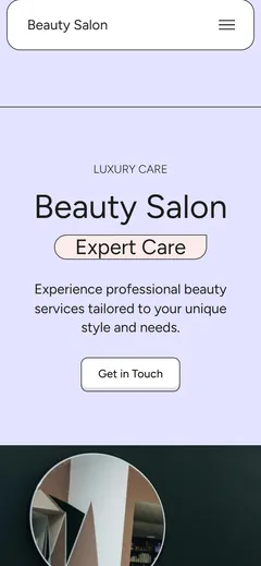
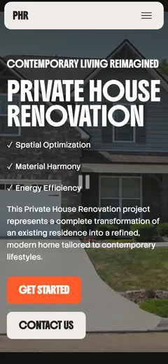
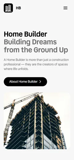
The phone screenshots at the top of this page are demo sites of recent Mobirise themes: a clothing brand, a medical clinic, a sportswear shop, an energy company, a beauty salon, a marketing agency, a renovation firm, a design portfolio, a home builder and a solar installer. Here is what a good mobile site usually puts first for different kinds of business.
Restaurants and cafés
A menu that reads well on a small screen, opening hours, a map and a button that calls to book a table.
Salons and studios
Services with prices, a gallery of recent work and a booking form people can fill in between appointments.
Trades and contractors
Before-and-after photos, the areas you serve and a quote request that takes a minute to send from a job site.
Online shops
Product cards, a cart that works with one thumb and checkout, or orders that come in as messages.
Clinics and practices
Treatments, the team, insurance details and an appointment form, with the phone number always one tap away.
Events
Schedule, speakers, venue and registration that guests open from a link they received in a chat.
Portfolios
Full-width images and short case studies that scroll smoothly, plus a simple way to get in touch.
Personal pages
One page with your links, latest posts and contact buttons, ready to share from a social profile.
Eight tips for a better mobile site
Responsive blocks handle the layout. These habits handle the rest, and each takes a few minutes in the editor.
Put the main action first
If people call you, the phone button belongs on the first screen. If they book, the booking button does. The same rule drives good landing page design.
Keep the opening short
One clear headline and a sentence or two. A long introduction pushes everything useful below the fold.
Crop photos for tall screens
Wide panoramas turn into thin strips on a phone. Choose pictures with the subject near the center.
Hold the phone in one hand
Scroll your own site with your thumb. Anything you have to stretch for is in the wrong place.
Delay the popup
A window that covers the page the moment it loads is the fastest way to lose a mobile visitor.
Check the contrast outdoors
Pale grey text that looks elegant on a monitor disappears on a phone in daylight.
Ask only what you need
Every extra form field costs replies. Name, phone and one question are often enough.
Test on a slow connection
Open the published site on mobile data, not office Wi-Fi, and replace any image that takes too long.
Where you can publish a mobile site
A mobile site is only useful once people can open it. Pick the option that suits you today; you can move the same site somewhere else later.
A free Mobirise address
Go live on a free mobirisesite.com address with HTTPS included, then paste the link into a message, a QR code or your social profiles.
Your own domain
On a paid plan, connect a domain you've registered anywhere: you update its DNS records at the registrar once, and the HTTPS certificate is issued automatically.
Your hosting, your files
From the desktop app, on any plan: send the site to your hosting over FTP, push it to GitHub Pages, or save the HTML, CSS and JavaScript and keep them wherever you like.
Mobile website builder FAQ
What is a mobile website builder?
A mobile website builder, sometimes called a mobile website creator, is a tool for making websites that work well on phones without separate design work for small screens. Mobirise is a responsive website builder: every block adapts on its own, so one site fits phones, tablets and desktops, and you can check each view while you edit.
Is Mobirise a free mobile website builder?
Yes. The desktop app is free with the basic theme, 200+ blocks and unlimited sites, and the browser builder gives you 3 free online sites and 3 AI generations a month. Free sites show Mobirise branding and may be personal or commercial. Premium themes, extensions such as Smart Cart, and custom domains on Mobirise hosting come with the paid plans.
Can I build a website on my phone?
Yes. On Android, the free AI Website Builder: Mobirise app generates, redesigns and publishes a site; on an iPhone or any other phone, Mobirise opens in the browser, so you can create a site with the AI, change the text and images and publish it without touching a computer. Detailed layout work is more comfortable on a larger screen, and the project is waiting for you when you sign in on a computer.
Can I change the layout only for phones?
No. Mobirise adapts every block to the screen automatically, so a change applies to phones, tablets and desktops at once and there is no separate mobile layout to maintain. If you want to hide or move elements on phones only, Wix's mobile editor offers that kind of control.
Why does a mobile-friendly site matter for Google?
Google looks at the mobile version of a page when it indexes and ranks it, so what visitors see on a phone is also what search sees. A layout that is awkward on a phone costs you in search as well as with customers.
Is a mobile website the same as a mobile app?
No. A mobile website opens in the browser from a link or a search result, with nothing to install. Mobirise builds websites, not apps for the app stores, and the same site also works on desktops.
Can I make my old website mobile-friendly with Mobirise?
Mobirise doesn't open HTML made in other tools, so the practical route is to rebuild the site: let the AI recreate it from a short description or from screenshots of the old pages, adjust the result, and publish it to the same domain. The new version is responsive from the start.
Can I create a mobile website with AI?
Yes. Describe your business in a sentence or two and the AI generates four designs with text and images. Each one is responsive and made for your site, so no two designs are alike, and you can refine it by asking the AI for changes or by editing the blocks yourself. One generation builds a page or a whole site draft; the free plan includes 3 a month, BASE 100 and GROW 1,000.
Can I sell products on a mobile site?
Yes. Product blocks list what you sell with photos and prices, and the Smart Cart extension, part of the paid plans, takes payment through PayPal or Stripe. For a lighter setup, each order can simply arrive as a WhatsApp message.
How much does a mobile website cost with Mobirise?
Nothing on the free plan: a free subdomain with Mobirise branding, or your own hosting from the desktop app, where you pay only the hosting provider and the registrar. Paid plans are yearly: KIT at $149 unlocks every premium theme and extension and removes the branding, BASE at $199 adds 3 online sites with custom domains and 100 AI generations a month, and GROW at $249 raises that to 10 sites and 1,000 generations.
How quickly can I make a mobile website?
An AI draft usually appears in under a minute. A small business site with your own text, photos and contact details usually takes an afternoon, because the mobile layout needs no separate work.
Does the desktop app work offline?
Yes. The desktop version stores projects locally, which lets you keep editing on a plane or a train. Generating with AI and publishing need internet access.
Your mobile site, live today
Start in the browser on whatever device is in your hand, or get the free desktop version for Windows, macOS or Linux. Both build the same responsive sites.